
Adding a Hero Content Block to Your Pages
Overview
The Hero Content Block is a full-width section that puts one message front and centre. It combines a small label, a headline, a short paragraph, and up to two call-to-action buttons, laid over a background photo or a solid colour.
Use it when a page needs to say one thing clearly: a featured departure, a seasonal offer, an invitation to get in touch, or a short pitch on a landing page.
You can add a Hero Content Block to your static pages, your blog posts, and any collection page that uses the section-based layout. It is available on every plan.
Websites created from the sample template already have a Hero Content Block on the home page. You can edit that one instead of adding a new section.
Adding a Hero Content Block
- Go to Main menu > Website > Pages > [your page].
- Click + Add Section.
- Choose Hero Content Block from the section-type list.
- The section is added in a disabled state, so it is not on your live site yet.
- Fill in the content and appearance settings described below.
- Click Save, then click the section’s toggle to enable it.
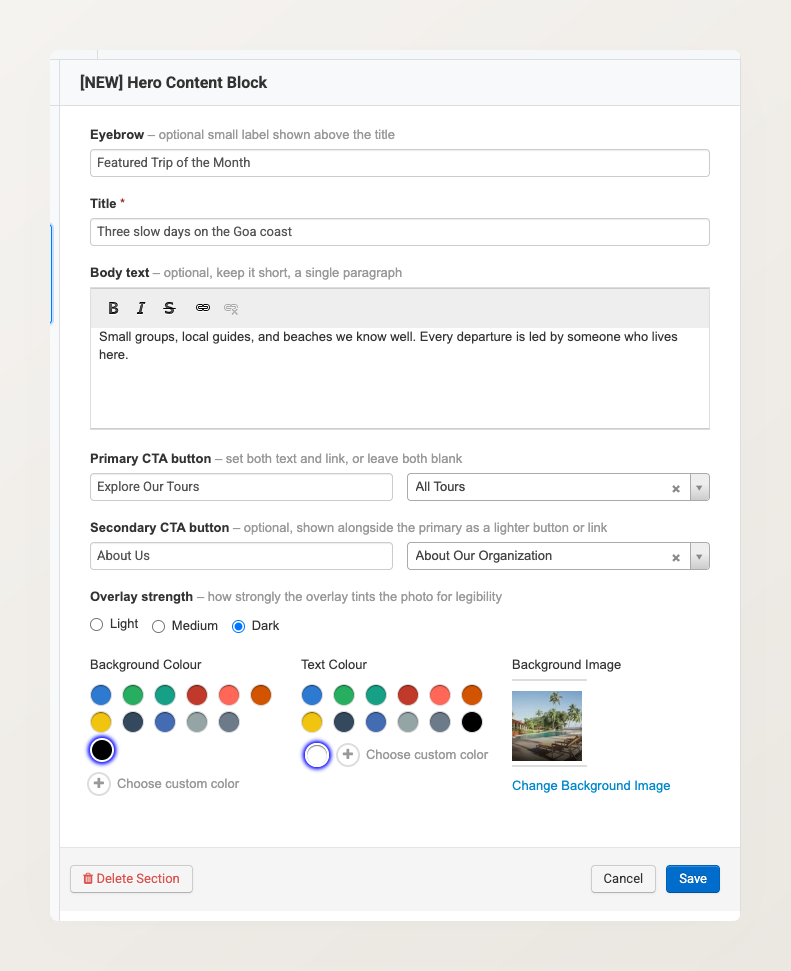
All of the hero’s settings live in a single editor panel:
On a blog post the sections live on the Content Sections tab of the post editor. On a collection page they live under Main menu > Products > Collections > [your collection], and the collection must be using the section-based layout first. If it is not, open the collection and click Switch to section-based layout. The Hero Content Block works the same way in all three places.
For reordering, disabling, and deleting sections, see Managing Website Sections.
Writing the headline and text
The Hero Content Block has three text fields:
- Eyebrow — an optional small label shown above the headline. Use it for context such as “Featured Trip of the Month” or “Now booking for spring”.
- Title — the headline. This is the only required field.
- Body text — an optional paragraph below the headline. Keep it to a single short paragraph, because the hero is a summary and not an article.
Body text supports bold, italic, strikethrough, and links.
Write the headline as a benefit rather than a label. “Small groups, led by guides who live here” gives a visitor a reason to keep reading. “Our Tours” does not.
Adding call-to-action buttons
You can add a primary and a secondary call-to-action button. Each button has two parts:
- Button text — what the button says, for example “Book Now” or “View Itinerary”.
- Link — search for one of your own pages, collections, tours, promotions, or blog pages. To point the button somewhere else, choose Custom URL and enter the address.
Set both the text and the link for a button, or leave both blank. A button with only one of the two is not saved.
The secondary button adapts to your website theme. When your theme uses filled buttons, the secondary appears as a matching outlined button. When your theme already uses outlined buttons, the secondary appears as a plain text link instead.
Two buttons work best when they serve different levels of intent. Pair a committing action (“Book Now”) with a browsing action (“See all departures”). Two buttons that do nearly the same thing just split the visitor’s attention.
Choosing a background
A Hero Content Block can sit on a background photo or on a solid colour.
To use a photo, click the + tile under Background Image and upload an image or pick one from your media library. To use a solid colour instead, leave the background image empty and choose a Background Colour.
The remaining appearance settings are:
- Overlay strength — how strongly the overlay tints the photo so the text stays readable. Choose Light, Medium, or Dark.
- Background Colour — the colour behind the content. On a photo hero this colour tints the image; on a colour-only hero it is the background itself.
- Text Colour — the colour of the eyebrow, headline, and body text. Tick Set theme color to follow your website theme instead of picking a colour.
Check the contrast between your text colour and your background. Light text on a pale photo is hard to read. If a photo is bright or busy, raise the overlay strength to Dark and use light text.
How it looks on your website
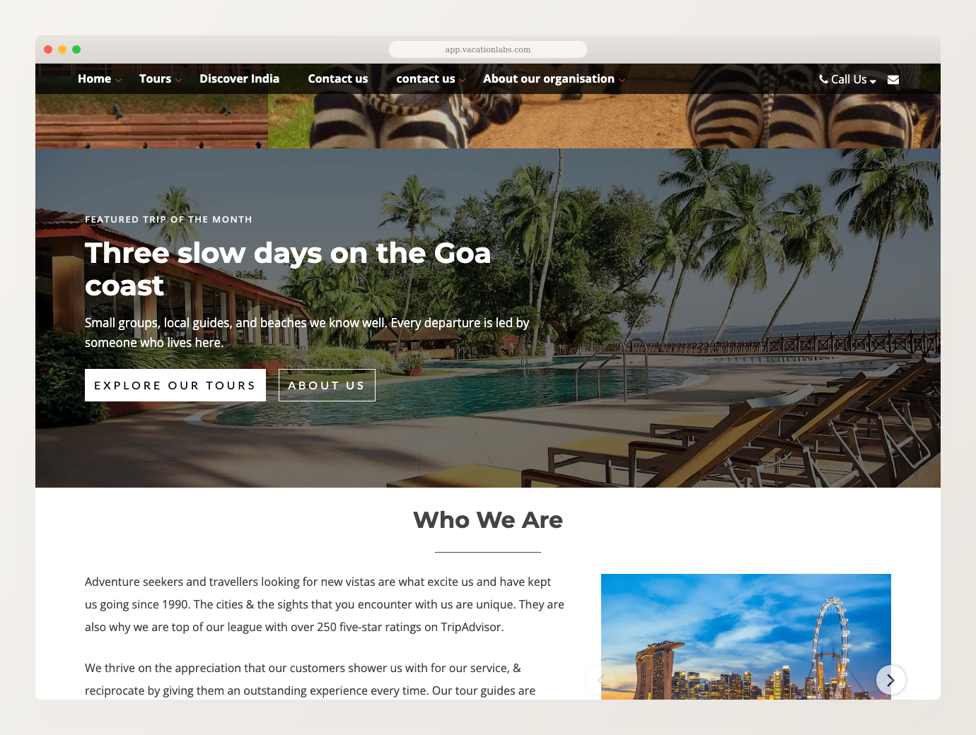
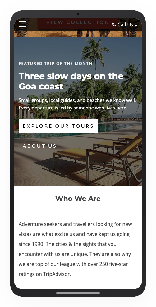
On desktop the hero spans the full width of the page. On a phone it keeps its full width, the text wraps, and the two buttons sit side by side.
Hero Content Block and Banner Slides
These are not two options for the same slot, so it helps to know what each one is.
Banner Slides is your page’s fixed first section. It always sits at the very top, it has its own design, and it is a carousel: it rotates through slides and can pull in tours, collections, and promotions automatically. It is built to show range.
A Hero Content Block shows a single message instead of cycling through slides, and it can carry up to two buttons. It is also an ordinary section, so it is not pinned to the top of the page. You can put it wherever you want below the banner.
You can use both on the same page, and on most home pages you want to. Keep the banner at the top to show everything you run, then place a hero further down that makes one specific offer.
Use one Hero Content Block per page. Two full-width messages on the same page compete with each other.
Related Articles
- Managing Website Sections — add, reorder, enable, disable, and delete sections
- Banner Slides: Adding Slides and Enabling Auto-Play — the rotating slideshow alternative
- Banner images and focus points — image size guidelines for full-width photos
- Rich Content Section with Photo Gallery — free-form text and images further down a page
- Understanding Your Website Pages — page types and what you can customise on each