
Building an Inquiry Form
Overview
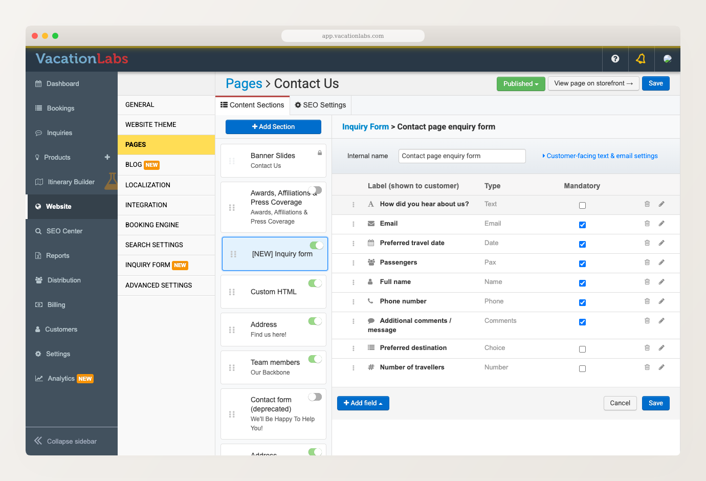
The form editor is where you decide what an inquiry form asks a visitor. It works the same way whether you opened it from a tour or from a page section, so everything below applies in both places. See Inquiry Forms on Your Website for how to reach it.
The field list
The editor lists every field on your form, top to bottom. A visitor sees them in that same order.
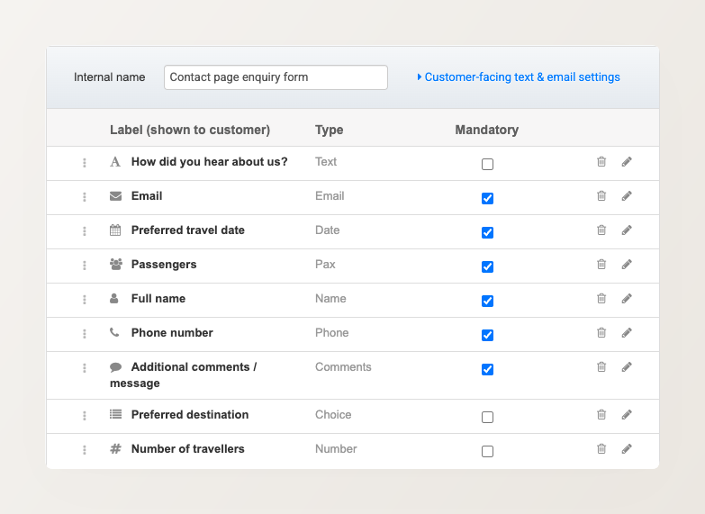
- Internal name is what you and your team call this form, such as International tour form, Domestic tour form, Weekend getaway form, or Contact page form. Visitors never see it, and it is the one detail every form must have.
- Label (shown to customer) is the wording a visitor reads above the field.
- Type shows what kind of answer the field accepts.
- Mandatory makes the field compulsory. You can tick it directly in the list.
Name the form after the kind of enquiry it collects. These names are the list you pick from when you point a tour or a page at a form, so a vague “Form 2” turns that choice into guesswork months later.
To change a field’s wording or settings, click the pencil on its row. To reorder your fields, drag a row by its three-dot handle. To remove a field, click the trash on its row.
A field you delete is only struck through until you save, and an Undo action appears next to it. So you can change your mind, and nothing is lost until you click Save. While a field is marked for deletion you cannot open its settings.
Adding a field
Click + Add field, then pick a type.
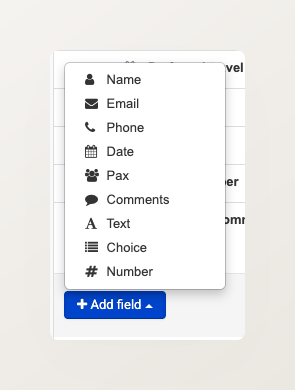
A new field arrives with sensible wording already filled in, and its settings open straight away so you can adjust it.
Settings every field has
Whatever the type, each field’s settings slide-out offers:
- Label (shown to customer) — the wording the visitor reads.
- Internal name — a short code shown just below the label, used in your CSV exports and in Zapier. It is fixed when the field is created and cannot be changed afterwards, because your exports and automations rely on it. Renaming the label does not rename it.
- Help text — optional guidance shown under the field.
- Required — customer must fill this in — the same setting as the Mandatory column in the list.
Most types also offer a Placeholder, the greyed-out example text shown inside an empty box.
Several types also accept two optional validations — checks the answer must pass before a visitor can submit:
- Length — a Min and Max number of characters. Leave either blank for no limit. It is useful for catching obvious mistakes, such as a phone number typed as three digits.
- Regex pattern — an advanced check that forces an answer into an exact format, such as a six-digit postcode, a vehicle registration, or a passport number. Leave it blank for no pattern check.
Patterns are easy to get subtly wrong, and a wrong one quietly turns away genuine enquiries. So if you want one, email support@vacationlabs.com describing the format you need and we will set it up for you.
Field types
Each type below adds its own settings on top of the common ones. They appear here in the order the + Add field menu lists them.
Name
Asks for the visitor’s name in a single box. Offers a Placeholder, plus the Length and Regex pattern validations.
Asks for an email address. Offers a Placeholder, plus the Length and Regex pattern validations.
Email format is always enforced, whether or not you set a pattern, so a visitor cannot submit something that is not an email address. A pattern adds a further constraint on top — for example, to accept only your own company’s domain.
Phone
Asks for a phone number as two boxes, each configured separately: a Country code and a Number. Both offer their own Placeholder, plus their own Length and Regex pattern validations.
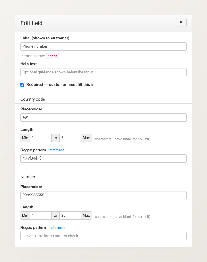
Splitting the two lets you keep the country code short and numeric while allowing a longer national number.
Date
Asks for a single date, such as when the visitor wants to travel. Offers a Placeholder and nothing else — a Date field cannot be restricted to a range.
Pax
Asks how many travellers are coming, as a row of counters.
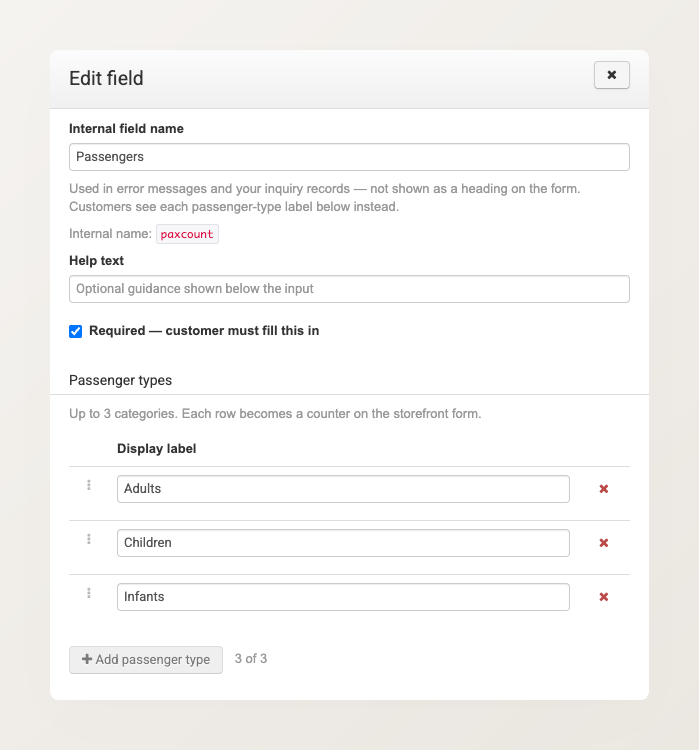
A Pax field is the one type whose label is not shown to customers, so it is called Internal field name here. It appears in error messages and in your inquiry records. Visitors see the individual passenger-type labels instead.
Set those labels under Passenger types. Each row becomes one counter on the form, so “Adults”, “Children” and “Infants” produce three counters. You can rename a row, drag it to reorder, or remove it. A form allows up to three passenger types, and the counter beside + Add passenger type shows how many you have used.
Comments
Asks for a long, free-text answer, such as the visitor’s travel plans. It is shown as a multi-line box that stretches the full width of the form. Offers a Placeholder, plus the Length and Regex pattern validations.
Text
Asks for a short, free-text answer — anything the other types do not cover, such as “How did you hear about us?”. Offers a Placeholder, plus the Length and Regex pattern validations.
Choice
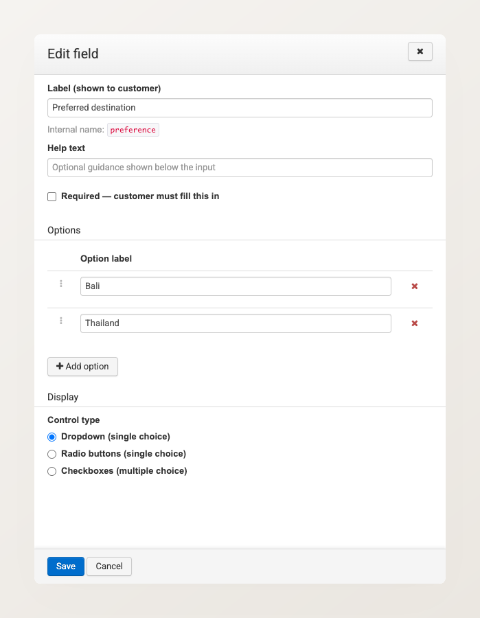
Offers a fixed list of answers, so a visitor picks instead of typing. That keeps your leads consistent and saves them effort — a list of the destinations you actually sell beats a free-text box you then have to interpret.
Build the list under Options. Click + Add option for each answer, drag the handles to reorder them, and click the red × to remove one.
Control type decides how the list is presented, and whether a visitor may pick more than one:
- Dropdown (single choice) — a compact list. Good for many options.
- Radio buttons (single choice) — all options visible at once. Good for a handful.
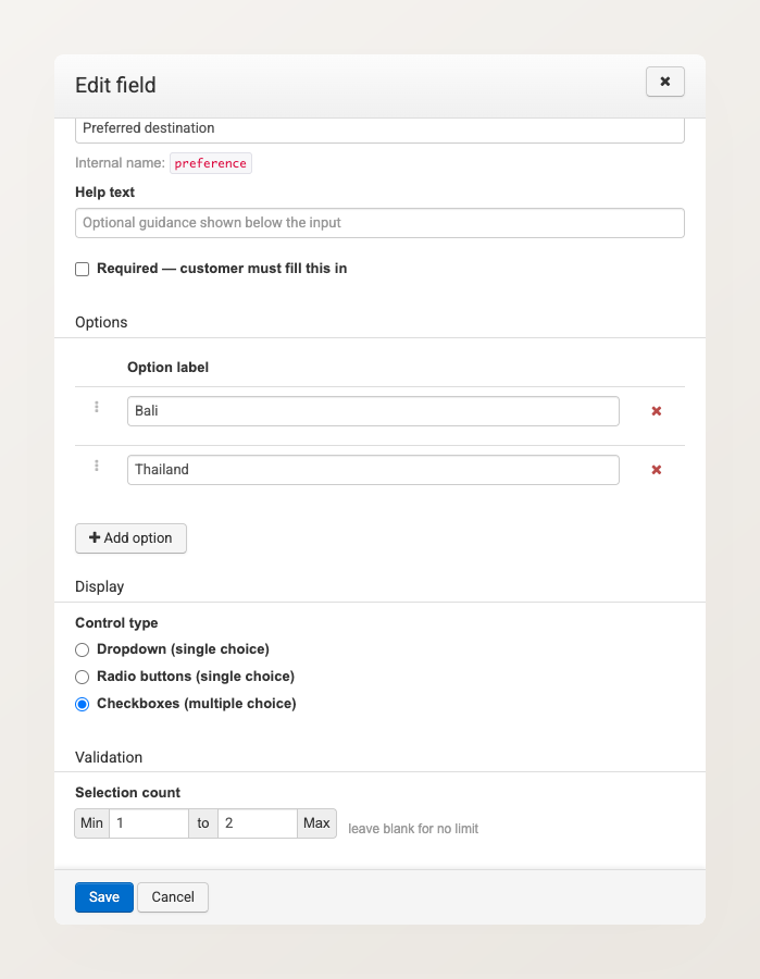
- Checkboxes (multiple choice) — the visitor can pick several.
Choosing Checkboxes reveals a Selection count, where you can set how few or how many options a visitor must tick. Leave either box blank for no limit.
Two things to keep in mind:
- Selection count applies only to Checkboxes. A dropdown or a radio group takes one answer, so it cannot be given limits. Switching away from Checkboxes clears any limits you had set.
- An option’s wording is also what gets recorded. Renaming “Bali” to “Bali (Indonesia)” changes what future submissions store, while inquiries already received keep the old wording. Prefer adding a new option to renaming one.
A form must keep at least one option on a Choice field, and no option may be left blank — either will block the save and point at the row that needs fixing.
Number
Collects a numeric answer, such as how many rooms a group needs. Offers a Placeholder, plus two settings of its own:
- Number type — Integer (whole numbers) rejects fractions, which suits counts of people or rooms. Decimal (allows fractions) accepts them.
- Bounds — an optional smallest and largest accepted value. Leave either blank for no limit.
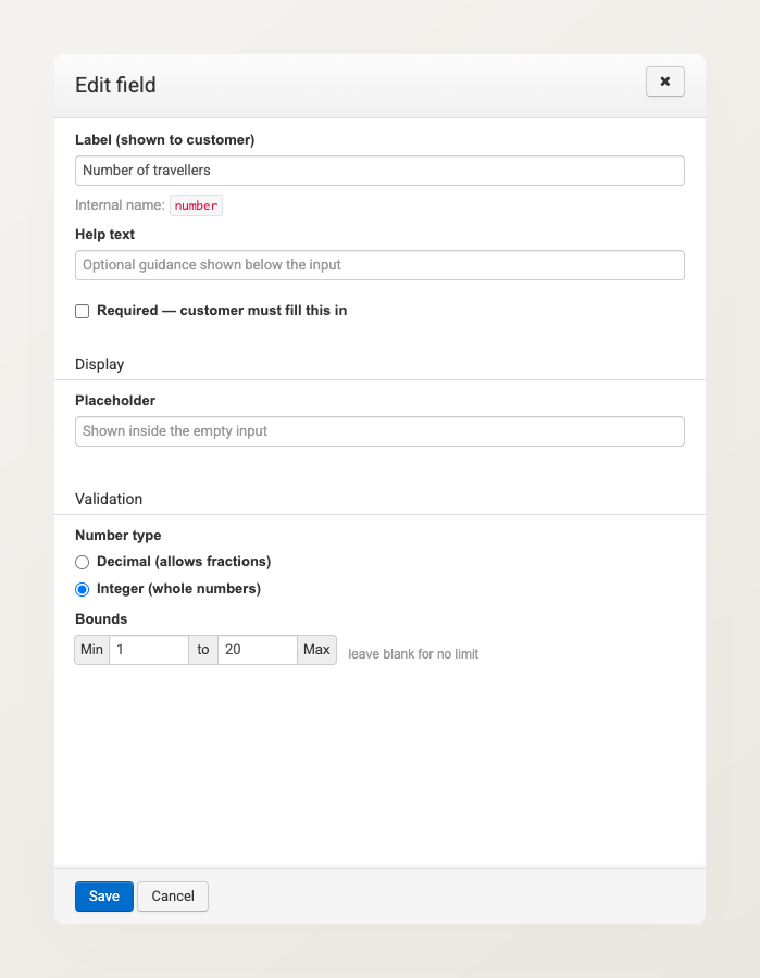
A minimum higher than the maximum is flagged as you type and blocks the save.
Bounds are enforced strictly on your website: a visitor cannot submit a value outside them. In the backoffice they are a warning only, so your staff are never blocked from recording a real inquiry that happens to fall outside the range.
The wording customers see
Click Customer-facing text & email settings to set the wording around the form, and the acknowledgement email a visitor receives.
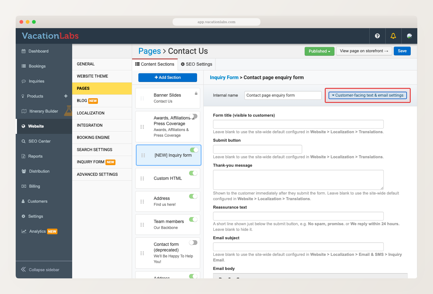
- Form title — the heading above the fields.
- Submit button — the wording on the button.
- Thank-you message — what the visitor reads immediately after submitting.
- Reassurance text — a short, quiet line under the submit button, answering the “what happens now?” a visitor has just before handing over their phone number. For example “We reply within 24 hours.”, “A real trip planner will call you, not a bot.”, “We will never share your details.” or “No obligation, no pushy sales calls.”
- Email subject and Email body — the acknowledgement email sent to the visitor.
Every one of these is optional. Leave a box blank and the form falls back to your site-wide wording, so you can set the wording once for your whole site and only override it on the forms that need something different. The form title, submit button, and thank-you message fall back to Main menu > Website > Localization > Translations. The email subject and body fall back to Main menu > Website > Localization > Email & SMS > Inquiry Email. Leave Reassurance text blank and no line is shown at all.
A specific promise does more work than a vague one, so “We reply within 24 hours.” beats “No spam, promise.”
Things to know
A shared form changes everywhere. One form can be used by several tours and by page sections at the same time. It is still a single form, so any edit you make here applies everywhere it is used. To change the fields for just one tour, create a separate form for that tour.
Related Articles
- Inquiry Forms on Your Website — putting a form on a tour page or any other page
- Managing Inquiries — view, search, assign, and export your leads
- Inquiry Reports (CSV Export) — your form’s answers in a spreadsheet